Asset Allocation & GDP bias
1 Introducing the MIA Asset Allocation process
What follows is an exploration of how the asset allocation grids are calculated for each Investor Profile. The whole approach is based upon the “Economic Clock Principle" which was further enhanced. The following data are processed:
GDP growth One- year forward looking trend (up, flat or down)
Inflation One - year forward looking trend (up, flat or down)
GDP Expressed in comparable USD for each country.
Investor profiles
The allowed minimum and maximum for each asset class have default settings for each Investment Profile (settings). You can see these in the Daily Asset Allocation Grid
All of the above data are used in the process for 40 monitored countries.
The macro-economic data (GDP growth trend and inflation trend) actually tell us which country is in which phase of its economic cycle. And that is done on a daily basis for 40 countries that are followed in this method.
The country GDP
This dictates the weight each country should represent in the asset allocation model. One could argue that market capitalization of a country could be used to determine weights. However, market cap is not a sole indicator of a country’s economy. Therefore the better choice, at least in my opinion, was GDP (in comparable USD terms).
The investment profile
The profile settings provide the limits per asset class (call it a range if you wish) within which an investor should navigate. Then the magic does its work and the result is a very easy to read and pragmatic guidance table on how to invest your portfolio, suggesting you how to fill the 12 boxes, i.e. which type of asset in which part of the world. All you need to do is check the daily asset allocation under "Asset Allocation" and check if your portfolio is not too far away from what is suggested. If there is a big change, then you may want to consider bringing your portfolio more in line with the suggested allocations.
That is not intended to happen too often, after all we are investors and not traders, but from time to time you may want to adjust and intervene. What comes next is a little bit more in-depth, don’t worry, it’s not only for geeks or nerds.
Table of contents
Introducing the MIA Asset Allocation Process
The Economic Clock Principle (ECP)
Introducing the notion of a “Flat” trend in the ECP
How exactly is an Asset Allocation Grid calculated ?
Load an investment profile
Establish an “asset rotation grid” for that profile
Establish the 4 base-case grids (up and down trends only)
Establish the grids for all scenarios (including the flat trends)
Country weight (GDP) comes into play
GDP Bias profiles
Economic scenario for each of the 40 countries
Composing the complete Asset Allocation Grid
5. Concluding
2 The Economic Clock Principle (ECP)
The principle
I believe this principle was introduced by Merrill Lynch (at least that is where I discovered it), and this approach found its way to other investment houses as a guide to work out asset allocations. All in all, it is a very elegant approach, easy to understand, and an excellent basis for work to start out with. The beauty of it is that only two basic macro-economic indicators are needed.
Inflation trend of an economy
GDP growth trend of an economy
ECP: the trend
As they say in Wall Street, the trend is your friend. And frankly, that is often, albeit not always, true. In order to figure out what the GDP growth or inflation trend is for a given country, the model uses the last known figures, and compares those to one year forward looking data. And then you get an idea whether indicators go up or down, et voilà, you have your trend. And we now have at least some idea of where in the economic cycle a given country probably is. As in any model, it stands or falls with the quality of data used.
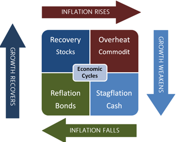
ECP: the four phases of the economic cycle
PHASE Growth and inflation trend Asset likely to be better
Recovery GDP Growth Up & Inflation Down Stocks
Overheat GDP Growth Up & Inflation Up Commodities
Stagflation GDP Growth Down & Inflation Up Cash & assimilated
Reflation GDP Growth Down & Inflation Down Bonds
Here is a visual representation of how that goes:

3 Introducing the notion of a “flat” trend in the ECP
The investment clock is a great tool but has certain limits. What do you do if there is not much of a change, or no change in a trend whatsoever?
You can and will at some point in time have a situation where there is no clear trend for a given country, where its inflation or growth neither goes up nor down. The original investment clock principle does not specifically handle the situation of a “flat” trend, of a “no change” situation.
So, in order to enhance the original ECP, the notion of a “flat” trend was introduced. Apply this to the economic clock principle as we know it, and you get nine (9) possible scenarios per country instead of four (4).
Those are the four base scenarios as described above plus
four intermediate scenario’s where either GDP growth trend or the inflation trend is flat and
a last scenario where both GDP growth and inflation trends are flat.
4 How exactly is an Asset Allocation grid calculated?
This may seem a bit candy for geeks at first, but it gives a little insight in the underlying “algorithms”. No panic, “Algorithms” is just an expensive word for reasoning steps, and there is no need to be an IT-expert to understand them. So, if you’re curious, just continue wrapping your head around the idea..
Step 1 Investment Profile
First, we load the minimum and maximum allowed per asset class for a given profile (profile settings) for which we need to calculate an asset allocation grid.
Step 2 Establish “asset rotation grids” for that given investment profile
For each of the 4 asset classes, this step calculates the percentage allocated to that asset class for every of the 4 base scenarios (i.e. point in the economic cycle), taking into account the minima and maxima as set out in the investment profile.
Step 3 Establish 4 “Base Case Scenario Grids” for up & down trends only.
With the “asset class rotation grids” obtained in step two, we now calculate FOUR separate asset allocation grids, one for each of the 4 basic economic cycle points. That implies a bit of rebalancing to take out over- and under weights, in order to get to a perfect 100% total when adding up the weights of each asset class. Every scenario now has its allocation grid which we can apply to each country we want to analyze. But what do we do now with the intermediate grids that have at least one flat trend?
Step 4 Establish “All Scenario Grids” by incorporating the flat trends.
In this step, the weights of the scenarios that contain a “flat” trend are added. This way we get nine economic scenarios in total:
4 base scenarios up and down trends only
4 intermediate scenarios containing 1 flat trend
1 with two flat trends.
That gives us a complete asset allocation grid which can be used for ONE given country. And the most difficult part of the job is done really.
Step 5 Country Weight comes into play
First, the GDP (in comparable dollar terms) is noted for each of the 40 countries the model processes. This gives us an excellent measure of the economic weight of a given country.
In this approach there are two huge heavyweights: the USA and China by themselves represent nearly 50 % of GDP of the 40 countries we follow. That is a very serious distortion.
If you live in Europe for instance, you are likely to be interested to have more in European assets in your portfolio. This natural investor bias can be solved by setting up “bias profiles” which tilt asset allocations more to the geographic zone where you live.
Step 6 GDP Bias profiles.
GDP bias profiles were created so that more weight could be given towards any geographic zone of our choice. A biased GDP profile can give overweight to the zone you live in. Originally, the following GDP bias profiles were used by default.
World1 = every country’s GDP counts for 100%
World2 = USA 75%, China 75%, India 75%, Japan 50%.
World3 = USA 50%, China 25%, India 50%, Japan 50%.
That was reviewed for clarity and eventually led to 4 GDP bias settings used today:
1. World : each country receives its normal GDP weight
2. EMEA : Countries in this zone get their GDP x 3.5 / AMER & APAC at 100%
3. AMER : Countries in this zone get their GDP x 2,0 / EMEA & APAC at 100%
4. APAC : Countries in this zone get their GDP x 2,0 / EMEA & AMER at 100%
The applied GDP multiplication factors do not have an academic or scientific underpinning. The current settings came to life by trying out multiple variations to get coherent outputs.
Since the USA (AMER) have GDP number 1 globally and China (APAC) has the second GDP globally, the effect of giving too much GDP overweight towards either AMER or APAC would have huge effects overall if either the USA or China have a change in their situation.
The EU (+UK) are part of EMEA and the whole has a comparable GDP to those other 2 giants, BUT is composed of a whole number of smaller countries each having a much smaller individual impact on the EMEA zone if something changes in just one EMEA country.
Step 7 Economic scenarios for each country
Here we determine for each country individually where they are in their economic cycle today. Remember, we have 9 possible scenarios that any country can be in, as derived from their GDP growth and inflation trends. In practice, this shows a simple “Growth/Inflation” trend result, each trend being either “up”, “down” or “flat”.
Step 8 Composing the finished Asset Allocation grids.
Country by country, we now identify
Their applicable weight = GDP x bias percentage (step6)
Identify in which point of the cycle each country is (step 7)
Now knowing what scenario to apply for a country, find (in grid step 4) the appropriate asset allocation.
Do that for all 40 countries, and you obtain a detailed asset allocation grid. Regroup that per geographic zone, and that gives you a very useable basic asset allocation grid for guidance that fits your investor profile.
And that basically describes the birth process of the Allocation Grids for each profile. Feel free to consult the daily grids on www.myinvestmentassistant.com
5 Concluding
Is it possible to build more detailed grids? Absolutely.
Individually tailored & more detailed grids may be made available as a paying service in the future if enough demand. Feel free to reach out in the contact page of Myinvestmentassistant.com should you wish to discuss.
Simply put, the underlying approach allows for
Bespoke Investor profile settings
i.e. minima and maxima per asset class per investor profile.
Customized GDP biases for:
Level 2 = AMER North + Latin, EMEA Euro + non-euro zone, APAC Asia & Pacific.
In level 2, it is possible to exclude one or more of these 6 zones
Level 3 = maximum detail asset allocation for all 40 countries individually.
In level 3, it is possible to exclude entire zones and/or individual countries.
With this approach, it is possible to create endless combinations to build individualized asset allocation grids. Investor profiles are adjustable, countries or whole zones can be excluded, GDP overweights can be set per zone, even per country.
This being said, custom settings are not possible on this website, but may become available as a paying service in a later stage when sufficient interest is shown.
Invest wisely and stay curious (& subscribe)


MY INVESTMENT ASSISTANT
IMPORTANT INFORMATION
Subscribe and get a free quickstart and clickable financial website list pdf
Empowering Investors with tools